Capsule Wardrobe Color Palette: Neutrals, Accents & Rules
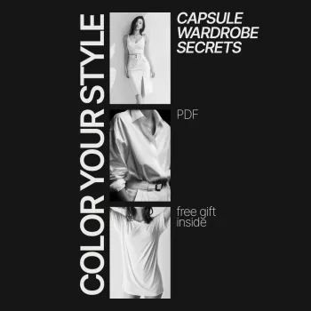
Color Your Style: Capsule Wardrobe Secrets for Choosing a Palette That Works
A capsule wardrobe feels effortless when the colors are planned. With a clear palette, outfits mix easily, shopping becomes simpler, and every piece earns its place. The key isn’t having fewer colors—it’s choosing the right few, then repeating them on purpose across tops, bottoms, outerwear, and accessories. Use the steps below to create a palette you can reuse season after season, whether your style leans polished, casual, minimalist, or bold.
Start with the goal: what the wardrobe needs to do
Before picking a single shade, define what your week actually looks like. A palette that works for office days can fail fast if most time is spent traveling, chasing kids, or dealing with extreme heat or cold.
- List weekly situations: work, weekends, events, travel, workouts, and weather extremes.
- Pick a style direction (polished, casual, creative, minimalist, romantic, sporty) and let color reinforce that mood.
- Decide capsule size and season (year-round vs. seasonal) so you don’t overload the palette.
- Identify your “outfit repeat tolerance”: subtle variation (more neutrals) vs. statement looks (more accents).
- Choose one or two “hero pieces” you already own (a coat, blazer, or favorite dress) and build supportive colors around them.
If you want a more guided, step-by-step framework with prompts and a ready-to-shop formula, the Color Your Style: Capsule Wardrobe Secrets – How to Choose Colors for a Capsule Wardrobe eBook helps turn preferences into a consistent palette you can actually shop.
Build your neutral base first
Neutrals do the heavy lifting in a capsule because they appear most often in bottoms, outerwear, shoes, and bags. Start with two anchors: 1–2 core neutrals plus 1 light neutral that sits near your face.
- Select 1–2 core neutrals for most bottoms and outerwear (black, navy, charcoal, chocolate, olive, camel).
- Add 1 light neutral for contrast near the face (ivory, cream, stone, light gray, soft white).
- Use your current reality: if most shoes and bags are black, a black-based capsule reduces friction.
- Consider climate and fabric: lighter neutrals can feel breezier in heat; deeper neutrals feel richer in cold seasons.
- Aim for consistency across leather (shoes/bags/belts) to multiply outfit combinations.
Neutral bases and what they pair with easily
| Neutral base | Best for | Pairs especially well with | Watch-outs |
|---|---|---|---|
| Black | Sharp, modern, evening-friendly | White, gray, jewel tones, denim | Can feel harsh in warm weather or very light wardrobes |
| Navy | Workwear, classic capsules | Cream, camel, light blue, red, blush | Harder to match with true black accessories |
| Charcoal/Gray | Minimal, versatile layering | White, blush, burgundy, cobalt, olive | Some grays read flat if fabrics are low-quality |
| Camel/Tan | Soft, warm, elevated casual | Navy, cream, forest green, rust | Can stain easily; needs mindful care |
| Olive | Relaxed, earthy, travel capsules | Cream, black, rust, denim, gold tones | Not all olives match—keep undertones consistent |
Choose 2–3 accent colors that feel like “you”
Accent colors are what make a capsule look personal instead of “generic basics.” Keep them limited so getting dressed stays easy.
- Pick accents from what you already wear most: a lipstick shade, a favorite sweater color, or repeated accessories.
- Limit to 2–3 accents per capsule to keep mixing effortless.
- Choose at least one “bridge color” that connects accents to neutrals (denim blue, soft burgundy, muted teal, dusty rose).
- Decide where accents show up: tops only, knitwear, scarves, bags, or one statement coat.
- Use prints strategically: a print that includes multiple chosen colors can “tie” the whole capsule together.
Thrifting is a smart way to test accents without committing to full-price mistakes. Smart Thrift: Unlocking Style Without Wasting Money – A Strategic Guide to Thrift Shopping is helpful when you want to fill palette gaps (like a rust sweater or a cream blouse) while avoiding impulse buys that don’t match your system.
Match undertones for harmony (without getting stuck on rules)
Undertones matter because they affect whether pieces look naturally “meant” to be worn together. Aim for harmony, not perfection.
If you want a deeper understanding of how color relationships work, the Encyclopaedia Britannica overview of color is a solid reference. For a practical angle on contrast and legibility, the W3C Web Accessibility Initiative offers clear, real-world guidance that also translates well to outfit contrast (especially for photos and professional settings).
Create an outfit-mixing rule so everything connects
Practical palette testing before buying anything new
Common color-palette mistakes that make capsules harder
A guided shortcut: using a structured system to pick capsule colors
FAQ
How many colors should a capsule wardrobe have?
A practical range is 3–5 core colors total: usually 2–3 neutrals plus 1–2 accents. Larger capsules and year-round wardrobes can handle more accents, while small seasonal capsules tend to work best with a mostly-neutral mix (like a 70/20/10 ratio).
What if favorite colors don’t match each other?
Choose one favorite as your primary accent, then add a bridge color that connects it to your neutrals. Prints can also solve this—look for patterns that include multiple favorites so they feel intentional together.
Can a capsule wardrobe include both black and navy?
Yes, but it’s easiest when you add a light neutral (like cream or white) to separate them and keep accessories consistent. If most shoes and belts are black, let black be the dominant neutral and use navy more in tops or knitwear (or vice versa).














Leave a comment